Mobile App User Flow: Map Journeys That Boost Conversions Fast
I once watched someone try to buy a coffee through an app while standing in the actual café. You know the scene—one hand holding a phone, the other holding a bag, a queue slowly judging them. They tapped “Order”, got asked to log in, couldn’t remember the password, got sent an email link… the link opened a browser… the browser opened the App Store… and by the time they were back in the app, they’d just… walked away.
That wasn’t a “marketing problem”. It wasn’t even a “design problem” in the way people usually mean it. It was a user flow problem—death by a thousand tiny steps.
If you’re building a mobile app for your business (or trying to rescue one that’s already out in the wild), a solid mobile app user flow is one of the fastest ways to boost conversions without playing whack-a-mole with random UI tweaks. It’s basically a map of how people actually move through your app—screen to screen, tap to tap—until they get what they came for.
And yes, it sounds obvious. But obvious things are the ones we skip when we’re busy.
What a user flow really is (and why it quietly runs your conversion rate)
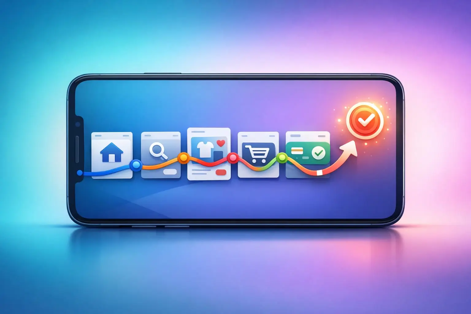
A user flow is a visual plan of the journey someone takes to complete a goal in your app—buying something, booking a call, submitting a form, upgrading, whatever pays the bills. It shows the steps, the decisions, the dead ends, and the little “wait, what?” moments that make people bail.
When people say “our app needs better UX”, what they often mean is: “people aren’t getting to the good bit.” That’s user flow. It’s the path. And paths can be smooth… or full of potholes.
The sneaky part is that you can have beautiful screens and still have a messy flow. Like a gorgeous shop where the checkout is hidden behind a curtain and guarded by a bouncer asking security questions.
Good user flows keep user needs front and centre through the whole product lifecycle. Not just at launch. Not just when you’re feeling inspired. Every time you add a feature, change onboarding, tweak pricing, or redesign login—your flow either gets clearer or it gets noisier.
Start with one goal. Not the whole app.
If you try to map every possible journey on day one, you’ll end up with a spaghetti diagram and mild despair. I’ve done it. It’s not a personality flaw—it’s just what happens when you treat “the app” as the unit of work.
Pick one conversion goal and map that. One.
Common high-impact user flows for a business app tend to be:
- Onboarding → first success (the moment they “get it”)
- Browse → purchase
- Search → view details → enquiry
- Trial → upgrade
- Login / password reset (always more important than you think)
Start with the one that’s closest to money or retention. If you’re not sure, pick the one your support inbox is quietly screaming about.
Then write the goal in plain language. Not “increase activation”. More like: “A new user books their first appointment without needing help.”
Map the journey like a human, not a diagram robot
Here’s a trick that sounds almost too simple: write the flow as a story before you draw boxes.
“I open the app because I need X. I see Y. I tap Z. I hesitate because… I continue because…”
That “hesitate because” line is where conversions go to die. And it’s where your user flow becomes useful instead of decorative.
Once you’ve got the story, turn it into a basic flow: entry point → steps → completion. Include decision points. Include errors. Include “user isn’t ready yet” branches. Real users are messy. Your flow should admit that.
A practical mobile app user flow usually includes:
- Entry points (ad click, App Store, push notification, email, direct open)
- Core screens (home, category, product, basket, checkout…)
- Actions (tap, swipe, type, scan, upload)
- Decision moments (sign up now vs later, allow notifications vs not)
- Failure states (invalid card, weak signal, wrong password)
- Success state (confirmation screen, receipt, next best action)
If you only map the happy path, you’re basically designing for a fantasy world where everyone has perfect Wi‑Fi and remembers passwords. Lovely place. Nobody lives there.
Where conversions usually leak (and how to plug them fast)
Most conversion drops aren’t mysterious. They’re boring. They happen where the app asks for too much effort, too soon, with too little payoff.
Here are the spots I look at first when I’m trying to improve an existing app user flow.
1) The “sign up wall”
If you force account creation before someone has felt value, you’re asking them to marry you on the first date. Sometimes it works. Often it doesn’t.
Can you let them browse first? Save sign up for when they try to do something meaningful—save favourites, checkout, book, message. Or offer a guest mode with a clean handover later.
And if you must require login, make it painless: Apple/Google sign-in, clear password rules, and a password reset flow that doesn’t send people on a side quest through their email app and a browser.
2) The “form that never ends”
Mobile forms are where motivation goes to get tired.
Cut fields. Then cut again. Use sensible defaults. Split long forms into small steps with visible progress. Let the camera do work (scan cards, scan documents) if it makes sense.
And please—if you’re asking for a phone number, tell people why. “For delivery updates” lands better than silence.
3) The “I don’t know what to do next” screen
Success screens are weirdly neglected. Someone pays, books, submits… and you give them a dead-end “Thanks!”
A good user flow keeps momentum. Confirmation should answer: What happened? What happens next? What can I do now?
That might be “Track order”, “Add to calendar”, “Invite a teammate”, “Continue shopping”, “Set up reminders”. Conversions aren’t always a single moment—they’re a chain.
4) The “tiny surprise” moments
Surprises in apps are rarely delightful. They’re usually things like unexpected fees, unclear delivery times, or permissions prompts that feel nosy.
If something might cause doubt, surface it earlier in the flow. If you’re going to ask for location, do it when there’s a clear benefit—“Find stores near you”—not immediately on launch like a needy stranger.
User flows aren’t just for designers (they’re for arguments, too)
I mean that in a loving way. A user flow is one of the best tools for team collaboration because it turns opinions into something you can point at.
Designers see where screens connect. Developers spot edge cases and technical constraints early. Marketers see where acquisition traffic actually lands and whether the message matches the experience.
And when someone says, “We should add a pop-up here,” you can ask: Where does it sit in the flow? What does it interrupt? What problem is it solving? The flow becomes the shared map. Less guesswork. Fewer meetings that feel like group therapy.
It’s also a brilliant roadmap for an app redesign. You don’t have to “redo the whole thing”. You can target a specific feature—like the login process, checkout, or onboarding—and improve it without breaking everything else.
A simple way to build a mobile app user flow (that you’ll actually use)
You don’t need fancy tools to start. You need clarity. Here’s a process that’s saved me from overthinking more times than I’d like to admit.
- Pick one goal. Make it measurable (purchase, booking, enquiry, upgrade).
- List entry points. Where do users start this journey, really?
- Write the happy path. The shortest believable route to success.
- Add the top 5 failure paths. Wrong password, no stock, payment fails, user gets distracted, weak signal.
- Mark friction. Anywhere the user has to think hard, type a lot, or wait.
- Decide what to remove, delay, or explain. Those are your fastest wins.
Then—this is the part people skip—watch someone use it. Not in a lab. Just a quick session with a real person and a phone. If they hesitate, your flow has a kink in it. If they ask a question out loud, that’s gold.
Analytics help too, obviously. Funnel reports, drop-off points, rage taps, session replays if you’ve got them. But don’t let dashboards replace basic observation. Numbers tell you where. Watching tells you why.
Keep the flow alive, or it quietly rots
User flows aren’t a one-and-done deliverable you file away like an old receipt. Apps change. Teams change. Priorities drift. And suddenly the app has three different “Continue” buttons that do three different things because everyone shipped their bit and nobody looked at the journey.
Any time you add a feature, run a quick check: does it shorten the path to value, or lengthen it? Does it clarify, or distract? If it adds steps, is it earning those steps?
I like to keep a “current state” flow (what the app does today) and a “next state” flow (what we want it to do). It stops redesign conversations from turning into vague dreams. You can literally see the difference between “nice idea” and “better journey”.
Because at the end of the day, your mobile app user flow is just a promise. A promise that when someone opens your app with a need, you’ll help them get to the other side without making them feel stupid or tired.
And if you can do that—quietly, consistently—conversions tend to take care of themselves.